

From Pixelated to Perfect: The Evolution of our Icon System
Elevating Hashnode's User Experience Through a Tailored Icon Suite


Hey Hashnode community! I am Joshua 'Navi, Product Designer here at Hashnode and you are welcome to our design blog!
At Hashnode Design, we've been working hard to craft a very solid experience that feels both seamless and intuitive for you. A significant part of this journey involved a thorough overhaul of our icon system.
I first shared a snippet of the work we've been doing on X (fka. Twitter), in March:
In this article, I will explore the reasons behind the change, the challenges we faced, our process and the result that is a refined set of icons in harmony with our vision and user needs.
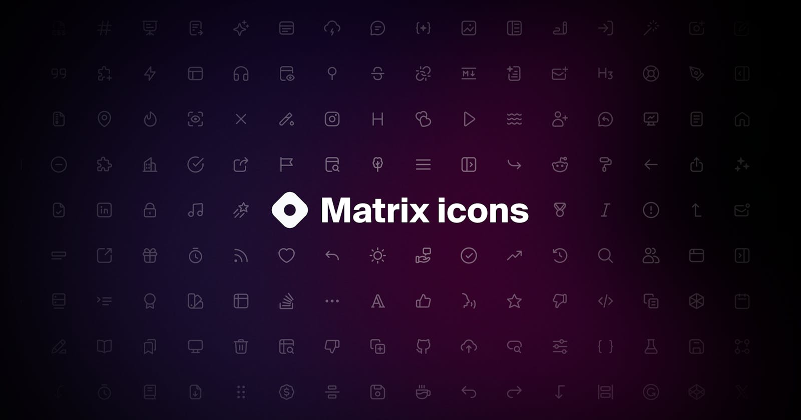
Today's world is dominated by visual content. Even the smallest graphical elements on a product interface, like icons, carry significant weight in creating an immersive user experience. Towards the end of Q4 2022, we decided to update our icon library to better align with the design language we were finalizing. The outcome is the stunning icons you see on our platform's interface today.

But, why?
Previously, we used the icon suite from Font Awesome which served us very well while starting out. However, as our direction evolved, we needed an icon suite tailored to resonate perfectly with our product's design language and overall vision.
Some challenges we encountered with the previous icon suite:
Complexity
Our design language is simple, modern, and intuitive. The previous icon suite did not meet these requirements, as some of the icons were more complex than desired, thereby increasing cognitive load unnecessarily.
Customizability
One of the most pressing challenges we faced with the old icon library was its limited customization. Pre-designed libraries often offer a ton of generic options, but there's an inherent limitation to how much they can be tweaked to suit specific needs. We often found ourselves in situations where we needed an icon either to clearly communicate an action, to offer a slight variation, or to present a different style that would seamlessly blend with our design. These modifications were either not possible or required tough workarounds, leading to inconsistent visual representations.
This limited flexibility made our design process harder and sometimes made things confusing for our users, as some icons failed to clearly show what they were meant for. An icon suite—regardless of its size—is insufficient if it cannot be adapted to reflect a brand's ethos and the subtle demands of its interface.
Cohesion
This was another prominent challenge we encountered across our old suite. Although individual icons from the old library looked good on their own, they were inconsistent when placed together. The inconsistencies varied from difference in stroke width and curve radius to difference in design language and an overall mismatch in theme. As our product grew, so did these inconsistencies, causing a fragmented visual experience. We wanted our visual story to properly reflect our brand, so we needed a set of icons that were diverse but also worked well together. Each icon had to feel like part of a unified family that aligned with our product's design principles for intuitive user interactions.
The design process
At the inception of the update, we considered and explored different icon libraries like Anron, Untitled UI, and some others but discovered that no one library actually matched our product's personality. We started by optimizing to fit before creating new icons entirely.
During the process, we were able to define a language and rule for the icons we had created and would be creating. It read; "The Hashnode Matrix icon set follows a unique design language: simple, straightforward and easy to process. It is important to follow this design language when contributing a new icon to ensure all new additions feel at home in our product interface."
The Hashnode Matrix icon set follows a unique design language: simple, straightforward and easy to process. It is important to follow this design language when contributing a new icon to ensure all new additions feel at home in our product interface.
A pivotal moment in the design process was when Fazle Rahman shared his vision for the new icon library. He said, "I want the entire theme to be so simple that it can almost be drawn with a single line." This provided strong validation for us, as it aligned perfectly with the concept we had been developing!
What's new?

Three defined sizes: 24px, 20px and 16px
One thing that was important to define was the sizes we'd be implementing going forward. We decided on 16px, 20px (our most frequently used size), and 24px with 1px, 1.25px, and 1.5px stroke widths, respectively.
The previous library we used did not have properly defined sizes that worked well our design tool, Figma. Additionally, there was no existing size for code at the time.


Overall icon refresh
Beyond size optimization, we did a comprehensive icon refresh to ensure our icons not only function but also feel integral to our evolving brand story. This refresh is more than an aesthetic update; it's a deliberate move to align every visual element with our product's ethos and direction.
Unlike our previous library, which had noticeable discrepancies in style, our new suite boasts a consistent design language. Every icon, old or new, has been meticulously thought-out and refined, ensuring a seamless and modern experience across our interface.

(After) Updated icons alongside our revamped feed.

(After) More cohesive, better aligned icons.

Improved active states
For better clarity, active states now fill up part of the icon instead of just making changes to the colour.
In retrospect
Our journey of redefining our icon library wasn't just about creating appealing elements; it was a holistic exercise in enhancing our user experience, understanding our product's essence, and ensuring every tiny visual element echoed our brand's philosophy.
As the digital landscape continues to evolve, so will the ways we interact with it. What we've crafted now isn’t just a set of icons, but a testament to how meticulous attention to detail can profoundly impact user interaction.
To those embarking on a similar journey, remember that beyond aesthetics, it's about understanding and enriching every touchpoint a user has with your product. So dive deep, innovate, and most importantly, keep your users at the heart of every design decision.
Finally, in design, as in life, it’s the small things that often make the biggest difference. ✨
Subscribe who?
The evolution of our product's visual story is a thrilling journey, and we're just getting started! We invite you to join us in this exciting phase as we continue to innovate and refine our product.
By subscribing, you will not only get front-row access to the stories, insights and lessons we’d share, but you will also be a valued part of our design conversation. Your engagement and feedback will always be the one driving force behind our commitment to excellence. Let’s shape the future of Hashnode Design together! 🚀